.jpg)
Winter is the color of white snow and grey skies. But it is also the season of Christmas and festivities. Winter may bring the cold and snow, but it has plenty of colors.
A winter color palette is mainly made of colors inspired by the season. It has colors like grey, steel gray, sky blue, and even green and red.
Winter is the best part of the year, with one of the main reasons being the gorgeous colors you can play around with.
We have curated some beautiful winter color palettes you can use. But before getting into the winter palettes, it is essential to learn about the seasonal color analysis of winter palettes.
Seasonal color analysis is a technique used in the fashion and cosmetics industry to decide the colors of clothing and makeup that harmonize with a person's skin complexion, eye color, and hair color.
It considers the coloring and undertones of a person's skin tone, hair color, and eye color and categorizes them into seasons (Summer, Winter, autumn, etc.).
The colors in the Seasonal Color palette are the ones that will work best with your natural coloring.
Each season has subcategories, and it's better to stick to them.
There are four types of winter palette - deep winter/ dark winter, Cool Winter, bright winter/ clear winter, true.
People in these subtypes have defining features like different natural coloring, eyes, and hair colors. And then, Color analysis is done based on what looks beautiful in each tone.

Deep Winter is also known as dark winter. You are a deep winter if you have the following features -
It doesn't matter whether you have fair skin like Anne Hathaway or dusky skin like Priyanka Chopra; both are in the deep winter category.
You are also considered a deep winter if you have the abovementioned features.
The winter colors that suits you are black, white, grey, pink, and blue.
If you have any of these features, you’re a Cool Winter:
Think of Lauren Graham from Gilmore Girls. The defining feature of Cool Winter or light summer is the lack of contrast between the coloring.
The medium tone of colors looks more appropriate on Cool Winter people. Pastel or light colors need to be avoided. However, it is alright to deviate from the assigned Cool Winter colors and go for darker shades.
Seasonal color analysis is about wearing what suits you according to your color. If you have the following features:
Then wearing anything in the Bright Winter color palette will look great on you.
Bright or Clear Winter has a high contrast between skin tone and hair and eye colors.
Unlike Cool Winter, where there is blonde hair, Bright winter is about dark hair.
Colors like true blue, true red, and true pink look better in clear winter. True colors are the most flattering colors in this type of winter.
True winters have higher contrast than the one mentioned above. They have the following characteristics-
Winters can wear all the colors in the winter palette.
However, it is better to wear colors in the subcategory according to seasonal color analysis.
Holly berry red, emerald green, cobalt blue, and stark black and white, all worn in high contrast, look great on True Winter.
While seasonal color analysis can tell us what makes dark blue eyes pop or what looks excellent on neutral skin tone. It is also essential to know that winter season colors have more functions.
As we mentioned before, we have curated winter palettes that you can use in fashion, make-up, decor, and even branding. Let's get started.

Winter Wonderland captures the fantastic color palette of what winter is like.
Have you seen the sunshine on snow on the top of a mountain? The pink tinge and orange hue light up the sky, giving the greys and white a hint of color.
Winter wonderland has lilac, purple, dark purple, mauve, blush, and golden hue. This color palette will be flattering on Cool Winter type cool undertones.
It will also look great as a living room design,

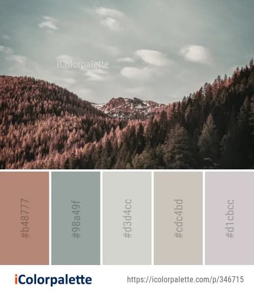
Dark Foliage has the deepest colors of the season. It has charcoal gray, grey, black, pine green, and dark mauve colors.
This palette would; look stunning on deep winters with yellow undertones or even blue undertones.
It would be a classy choice to spruce up a living room for winter in decor. You can create a luxurious retreat with a dark foliage color palette.

Romantic winter nights is a symbol of romance. Songs and poems have been written about lovers spending nights on roofs, looking at the moon.
The romantic winter nights palette has deep winter colors like black, dark blue, dark grey, and white.
Furthermore, it also has a beige or cream accent color that denotes the creaminess of the clouds and would look gorgeous on deep winters.
In interior decor, it would also create a stunning decadent winter-themed bedroom.

Winter isn't always about deep colors. While the seasonal color analysis may not encourage pastel colors on winter types, pastels have a way to lighten up a room when it comes to celebrations.
While the seasonal color analysis may not encourage pastel colors on winter types, pastels have a way to lighten up a room when it comes to celebrations.
The Holiday Tones color palette has shades of blush, light pink, sage green, grey, silver, and white. The colors are muted, mainly like light summer, but they look fantastic when put together.
If you want a different color theme than red and green for holidays, this option is on the table.

Winter scenes are almost filled with pine trees and snow. All the roads seem dark and white.
The Woods is a lovely dark and deep color palette — inspired by winter's dark colors that consist of Black, browns, gray, and white.
It edges towards the deep winter palette, so deep winters should use this. A black color-themed room with softer fabrics, like white fur and silk, would look opulent in decor.

Green and red are the classic Christmas colors. But apart from bright colors, some neutrals could also look equally beautiful.
Christmas Zing uses red and maroon on a high contrast level with beige, sienna, and white. Red and browns are typical autumn colors, but they also look warm in winter.
Christmas Zing is a color palette that uses colors from the Deep Winter palette and adds a hint of lighter colors for higher contrast.
It looks fantastic on Deep Winters, as well as in Christmas decor.

Other seasons may have their charm, but winter comes during the best time.
People love to relax and unwind with their families at the end of the year as it’s the holiday.
The Cozy Snow Cottage palette has light colors like grey, white, steel grey, dark grey, coffee brown, and peach.
It has colors from the Clear or Sprinter winter palette. These colors are best on fair skin with dark brown hair and blue eye color.

The cold season brings natural delights, pine trees, and fog! Into The Woods encapsulates the colors from a cold winter morning in the woods.
Pines, haze, mushroom, earth, and mustard come together to form the palette. It creates a perfect capsule wardrobe color scheme for winters.
This color scheme has a stunning color that isn't in the winter palette - mustard. However, it belongs to the deep autumn type and is used as an accent color here.
The Into The Woods palette would look beautifully calming in a cozy living room.

As mentioned before, light or bright color doesn't belong in the winters. But this palette is a genius idea for instilling cooler colors into the season.
The palette uses icicle, star dew, and berry color to make a beautiful scheme.
It may not be season-appropriate, nor would it help much in seasonal analysis, but this light palette would rock in a carefully decorated bedroom.

Some winter color palettes are too faithful to the season. The Christmas Wreath has many deep winter colors like brick red, olive, dark blue, midnight blue, grey, and brown.
These colors would sit well with people with the same dark eyes and hair colors, and warm tones. You can use these colors to create a spectacular space in addition to fashion.
It resembles a fall color palette in fashion in the interior decoration industry.

Snowy Road isn't a palette derived from seasonal color analysis because It is inspired by snow and clear blue skies. It has shades of greys and blues. Graphic designers often use these colors in branding or designing.
As pastel colors are in fashion, adding pastels and neutrals balances the design. Snowy Road has just the right shades if you want a classy brand color palette. You can also use it for winter wedding decor.
Every festival has its colors. Christmas colors like green and red have been the festive shades for centuries.
The Nothing Like Christmas palette is all about greens, reds, and white.
It is a classic Christmas color scheme that never goes out of style. The colors are from the clear/ bright palette of the season. Whether for Christmas decoration, outfits, or gift selection, you can never go wrong with using this color palette.

When you wake up on Christmas morning, with the tree and gifts, and your family around you, you just want to drink a warm coffee or hot chocolate to get the day started.
The Coffee in Christmas Morning palette captures the intimacy of the season.
Tan, pine, red, brown, and black form a stunning palette. While red and green make Christmas fun, adding some neutrals like beige and brown makes it a mature winter season palette.

Wearing black or brown in winter is a safe choice. A black turtleneck with beige or tan pants is a classic fashion choice.
Winters Browns is a palette that throws seasonal analysis out of the window and embraces the season's colors.
Tan, brown, olive, sienna, and black are the few colors in this palette. It mostly looks like a fall or autumn palette, but you can also use it in winter.
Nothing warms up winters more than the earthy tones on walls.
Embracing the balance of colors is vital when choosing a palette. Tinted Winters is unlike other palettes; it does not work on seasonal color analysis.
But it has a pink tinge, rosy touch, golden glow, and greyish charm.
Sienna, cream, light grey, light mauve, terracotta, and sage green blend together to form a magnificent light-colored palette for the season.
Cool neutral textures with pops of 'rouge de fer" bring warmth to a room. It may not be a collection of popular colors, but the unique mix can create a lavish ambiance.
Color palettes are the basis of design. If you want to have effective branding, then colors play an essential role.
Everyone remembers the color of Pepsi, which is branding at its best!
If you also want to create an on-brand design, then Offeo can do the job for you. Offeo's On Brand Designs feature allows you to create tailored content according to your brand style and colors.
It also gives you the freedom to customize your brand color palette!
Offeo can not only create a beautiful winter palette for you, but it has tools that will transcend your ideas into videos. W
hat are you waiting for? Want to create short video ads? Need templates for social media content? Want to customize a color palette? Offeo is here to answer your every need! Just visit Offeo Features to find out more
More articles on Color Palettes:
Pastel Color Palettes | Home Color Palettes| Earth Tones Color Palette| Blue Color Palette | Rustic Color Palettes | Food Color Palettes | Neon Color Palettes | Nude Color Palette | Neutral color palette| Orange Color Palette | Aesthetic Color Palette | Pink Color Palette | Wedding Color Palette | Purple Color Palette | Gradient Color Palettes | Red Color Palette


.jpeg)


