.jpg)
When we hear neutrals, we all take a step back and categorize it for minimalists only. But, it is certainly not only that as it offers a classic and timeless appeal to anyone using it.
Even in interiors these days, we see shades of neutral playing a massive role in bringing the whole look together.
In color schemes, neutrals often play a secondary role. However, they have an important place in any design and can be used to create stunning looks that are anything but boring!
Neutrals occupy the supporting roles of many color combinations. Yet, there's nothing dull when you strategically use these colors to highlight your favorite features or contrast with other hues for low-key elegance.
Although people may not think about using neutrals heavily because they're so commonplace - these soothing hues add balance and harmony to your designs without being boring.
Neutrals are a class of colors that often appear to be without color. However, neutrals can have undertones like pink or gray, making them classified as greige (a newer and favored neutral).
They might also contain hues such as ivory, black, taupe, and white, which would call for different decorating strategies. You can use them in two primary ways: soft, neutral only, or quiet look without any dramatic accents, or the background colors for powerful design pieces with more focus on accenting them than others around it.

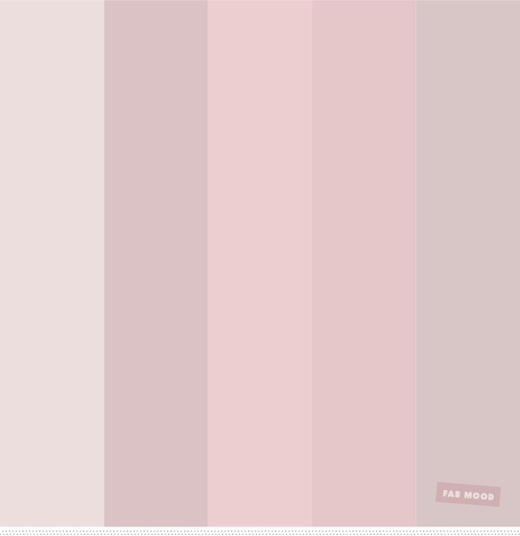
In this harmonious color palette, beige and barely pink intermingle nicely. Here, the "pink" shade works well with blue and ivory because it is a primary accent color that contrasts nicely against them both.
The overall scheme encourages subtle femme vibes but remains neutral enough to appeal to everyone--perfect for room decor for kids or Instagram handles!
You can also use this in food photography if you are shooting desserts like pies or cakes; combine light blue accents with sand browns (a cross between sky blues and golden sands) which will remind people of sunsets by the water's edge.
The white and grey shade plays a role in bringing in an airy vibe and beautifully links the blue, beige, and pink hues.

The color palette here is the perfect mixture of adventure and charm, so it's great for anyone looking to add a little flair to their interior design projects.
The colors are fresh, eclectic, and modern, with dark shades complementing light ones that help bring in calmness through neutral tones.
The color palette here is fresh and a bit daring, with shades of green plums to make it look even more interesting. The lighter tones provide just enough calmness in the background, while these darker colors bring out an adventurous side that your interior design needs!
The plum, orange, and green tones spice up this vibrant palate while still retaining a sense of calmness from using all those cool beige shades for everything else around it!
For some social media inspiration or any other designs, you may be working on, this mix in varying shades will surely get attention from viewers like never before.
This colorful inspiration will make your interior designs or social media accounts genuinely eye-catching and generate audience insights no matter where you use them!

Green is an excellent combination with brown, but these are not that talked about when we talk about neutral color schemes.
We decided to include it here in the list of the neutral scheme of colors because this palette is different from the rest. Green and brown are both nature-inspired colors and give a warm feeling.
The different shades of green, when paired with neutrals of brown, work well for your living room, where you want to have that cozy feel.
You can also use this in the kitchen and dining rooms if you want a country-inspired look. Add in some texture to this color palette and get one of the most beautiful neutral color palettes.

There are many colors to choose from when you want a calming space, but why not go with one of the most popular trends right now? There's been an influx in brown neutrals.
Not only do they provide comfort and warmth, but also sophistication thanks to their high contrast against pastel hues like pale pinks.
With just a touch of these earth tones near your light-colored walls and furniture pieces in your home decor, you can give any room that feminine feel while still feeling grounded.
You can use it on clothes, upholstery, or food palettes too.
Neutral browns and pastels make one such color scheme perfect for bedrooms that want to create welcoming comfort without sacrificing elegance, making this hue combination effortless no matter what setting you find yourself in.
Any living room with neutral walls draped in pale pastel hues will not look juvenile when you add dramatic brown fabric elements (like leather ottomans), grounding your color palette while lending it sophistication.

Gray can't go wrong, but with black? Black and gray are unexpected combinations that should work well. Gray is versatile enough to blend in seamlessly with other colors for a perfect neutral color palette.
Muted shades of grey create a calming atmosphere, while the darker grays give your design contemporary flair.
Use black as accent colors throughout this monochromatic scheme or sparingly at specific points like lamps or chairs, so you're transported into a fashionable modern world!
You can also use it in wall color to give it an edgy look in your master bedroom.
This color palette also is an excellent option for people who want to give their outfit a classic and timeless appeal. This combination will significantly increase profile visits if you wish to update your social media page for personalized content.

Coral is a color that has been embraced by both nature and optimism. This versatility makes it one of the most sought-after colors in fashion, architecture, design, etc.
Coral pairs well with neutrals just as beautifully as its family members do. Blue and coral can make for a gorgeous combination when paired with light blues, muted greens, or lilacs!
If you want to give your space some punch without overdoing it on the bright factor (a common pitfall), pair your neutral shade of coral with the choice of colors in this color palette offered here.

Light purple is a beautiful yet intense color that can work well in many different contexts, but it needs to be appropriately combined with other colors.
For example, warm neutrals like coral and grey bring out the elegance of purple while contrasting enough not to make one piece overpower another.
Using white also adds some more power to its neutrality.
A good rule of thumb for using this hue on its own would be the lighter shade, as doing so will help produce vibrancy without sacrificing too much serenity or classiness.
Light purple can be used as a paint color in this color palette with bright white and other wood tones to give a matte finish. Neutral paint colors can enhance the whole look of the space without making it look gaudy.

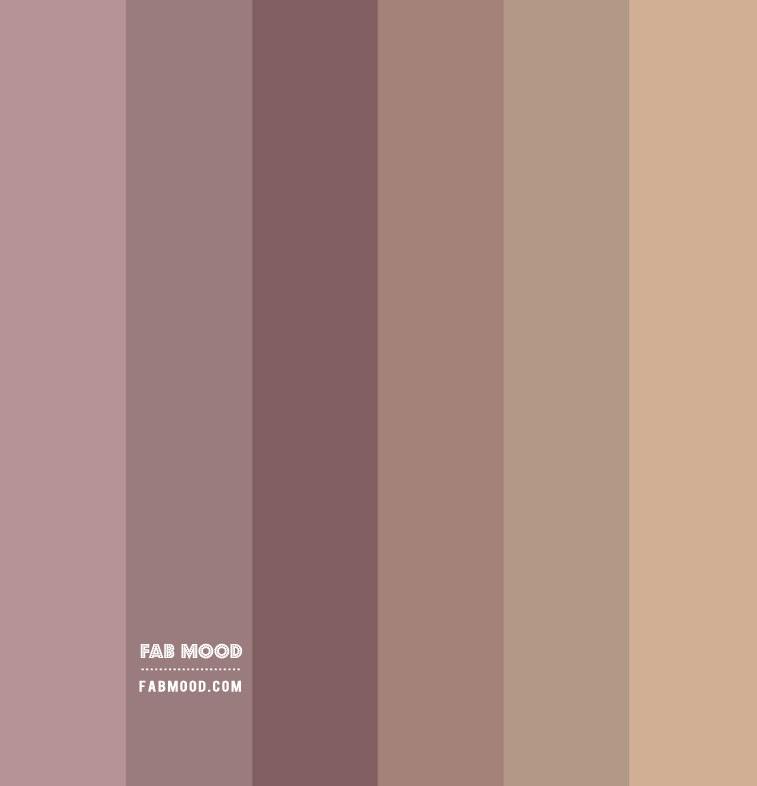
You can call Brown the most used neutral color. It is warm and renders a very sophisticated look. Paired with muted pink, it creates a homey feel that makes people want to come in for coffee or tea with friends.
In fashion, brown paired well against soft dusty pinks without being too loud of a color combination! This color palette is the best as it uses redwood and brown as redwood can create a warm and rustic look that will stand out from the crowd.
Redwood pairs well with other wood because it draws out brown tones in the wood while complementing warmer colors like tans.
You may opt for dark brown or light tan color depending on what type of contrast you're going for! This color scheme will work for your home's exterior.
As we've mentioned previously, Redwood can create a warm and rustic look that stands out. You can also use this in fashion and makeup, and food palettes.

A monochromatic color palette means committing to a single color, with an accent of complementary colors. This look is trendy and energizing for the room while using calming pinks or more vibrant purples as accents throughout the space.
If the idea of committing to one singular color makes you feel uneasy at first glance- don't worry! Monochromatic themes can be as bold or subtle as necessary.
Because here we are talking about an all-neutral color scheme, that is why we get to find the perfect color palette that will also be soothing to the eyes.

Brown and light brown are nature's colors. With their earthy, organic qualities, you can use them to create a natural look for your space with just the right amount of warmth!
Brown is an understated neutral with rich tones from deep chocolate-chocolate chip cookies to light oatmeal or cocoa buttercream - which will work well as warm accents in any room you're designing.
A dark brown color paired with crisp white or a light neutral makes this shade stand out beautifully; it captures our attention because one does not see such combinations often these days due to trends.
This combination opens up a whole world of possibilities when deciding how we want our living spaces decorated. This color scheme can also work well in living rooms and countryside houses.

Gray is a neutral color that straddles the line between black and white without being too dark or light.
This provides an understated hue but can be blended with other colors to create contrasting effects depending on your needs; it’s perfect for formal and informal occasions.
This color palette is versatile because it can work in summer or winter, in lighter settings like an oceanfront wedding reception or more formal gatherings like corporate holiday parties.
Gray looks beautiful with neutral blue colors and beige, which creates a fabulous color combination when added into grey's low-contrast shade selection; pairing them together makes for great combinations!

With so many shades and hues to choose from, gray is one of the most versatile neutral colors that you can use for any mood.
A cool feeling? Try blue-grays as a base with some accent color in your room decor to make a stylish statement. Dark neutrals are perfect when you want sophistication, while white will revitalize an already beautiful color palette by adding lightness.
Brown tones provide stability if there's too much going on in your space - don't forget about these little helpers! This neutral palette is straightforward and gives a voguish look too.
You can use it in office spaces or bathroom decor and design websites.

Lavender is an elegant and versatile color that can work well in any room in the house. The grayer tones are best for beige, yellow, golden, magenta & warm browns.
Add a pop of bright color with purple, and it will look great against lavender's dark hues! A touch of white or cream helps to calm arrangements, as do darker colors like navy blue or sage green compliment the brighter shades nicely.
Go subtle by pairing light lilac with barely-there gray lavenders to create a soft yet beautiful atmosphere around you! You can use it in rooms with colorful furniture and some art pieces and rugs for added texture.

Some colors just go together naturally. Lilac and pink are one of those combinations! You can combine these two shades to create a fashionable, feminine color palette with some contrast added for interest.
Some lighter tones like lilac are versatile and look great alongside analogous purples or softer pinks on the color wheel.
If you want something more understated but still elegant, try combining light lilacs with greys, dark purple, and soft pink hues as they blend seamlessly in this neutral scheme.
This color palette is perfect for a casual office setup or bedroom as it makes them look they are straight out of a fairytale. Thiscolor scheme has been made for a nice romantic design setup.
More articles on Color Palettes:
Pastel Color Palettes| Earth Tones Color Palette| Blue Color Palette | Neon Color Palettes | Nude Color Palette | Winter Color Palette | Aesthetic Color Palette| Wedding Color Palette |Purple Color Palette | Gradient Color Palettes | Red Color Palette | Fall Color Palette | Skin Color Palette | Winter Color Palette |


.jpeg)


